When the PWHL revealed jerseys for their inaugural 2024 season on November 14, the reception was almost universally negative. The vast majority of social media comments under every single team post about the uniforms were derogatory. Even people who have not been particularly critical of the PWHL up until this point were openly disgusted. While the initial backlash has died down, and there have been some positive reactions as well, the immediate response was pretty ugly. Some people in the comments are always going to be haters, but in a lot of friends and colleagues I also recognized the frustration that only comes when you really, really give a shit.
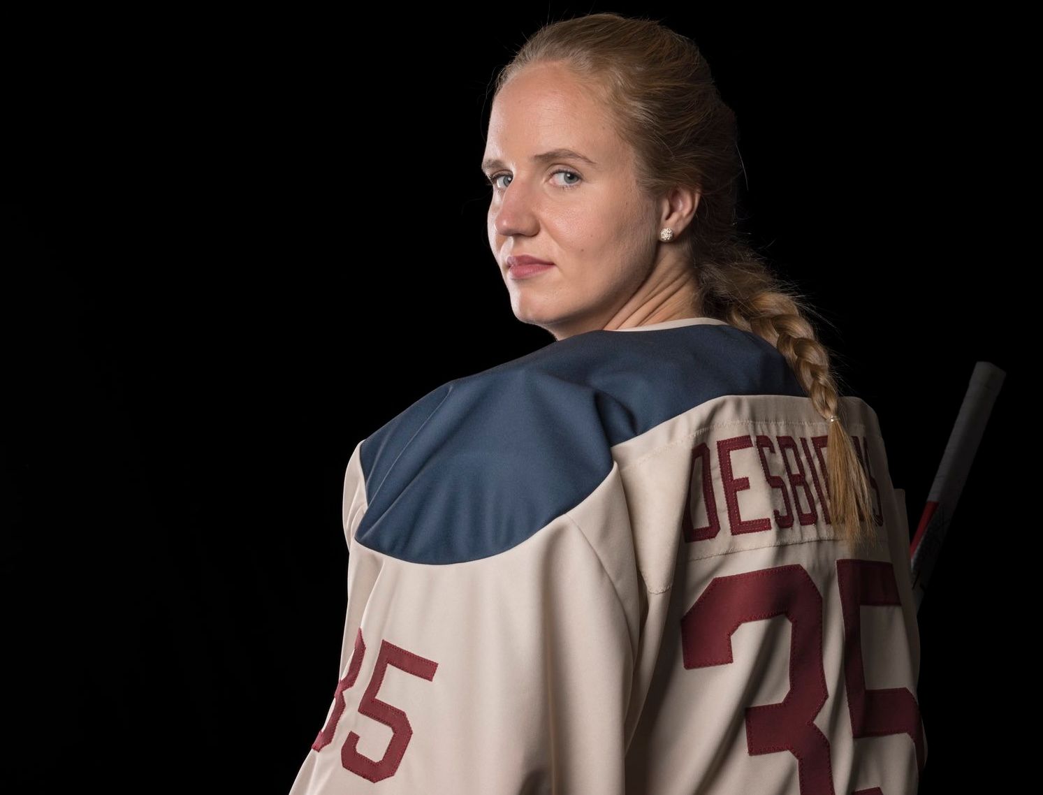
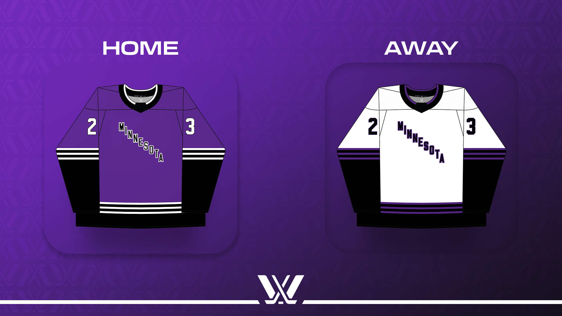
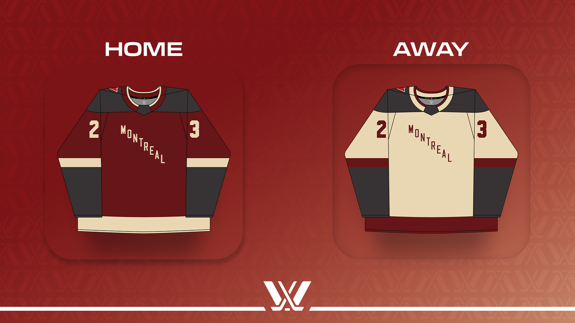
The jerseys all follow the same basic concept (the team market name is written in diagonal letters across the front), with variations in colors and striping. Each team has a home jersey (dark) and an away jersey (light).
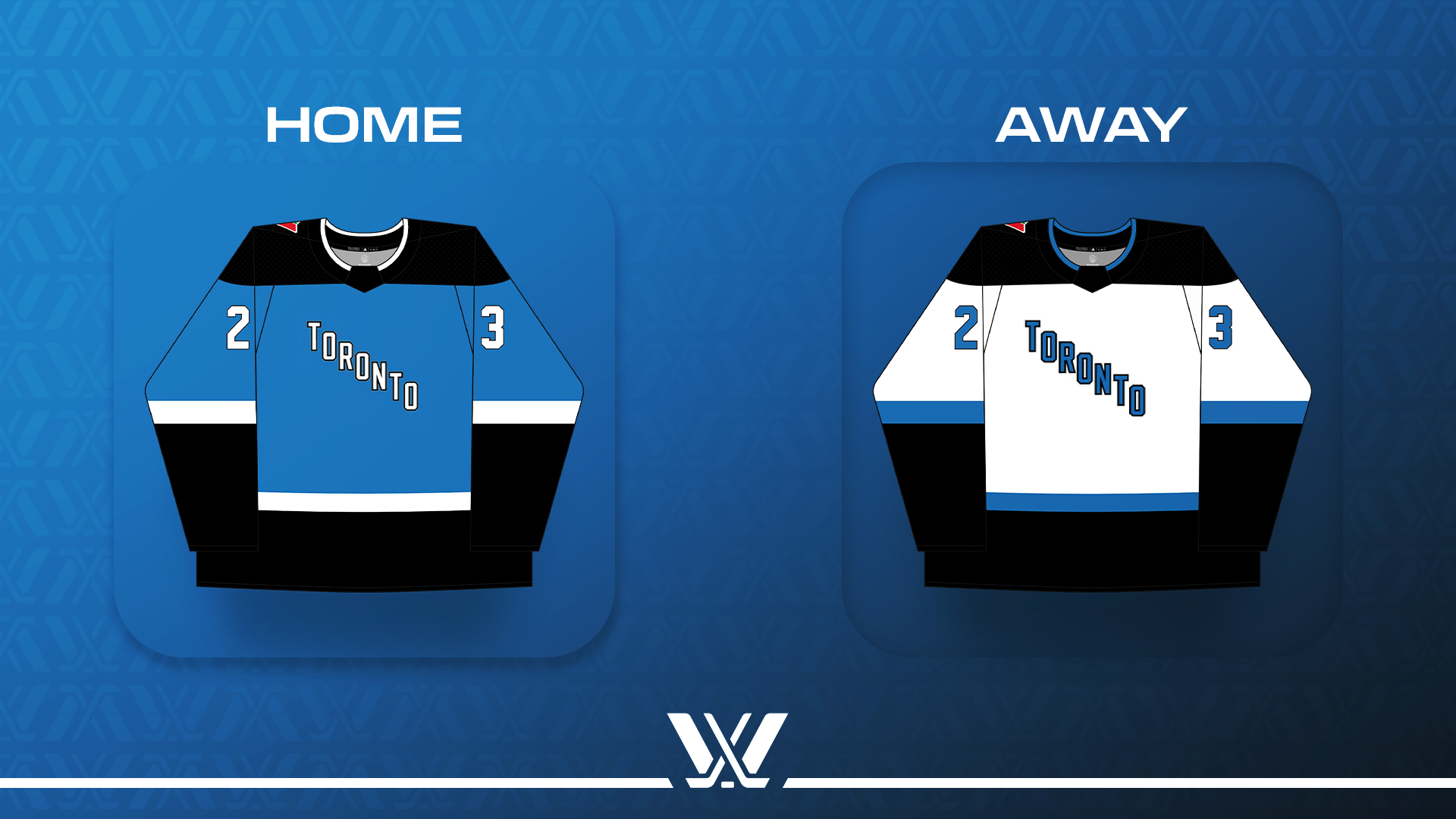
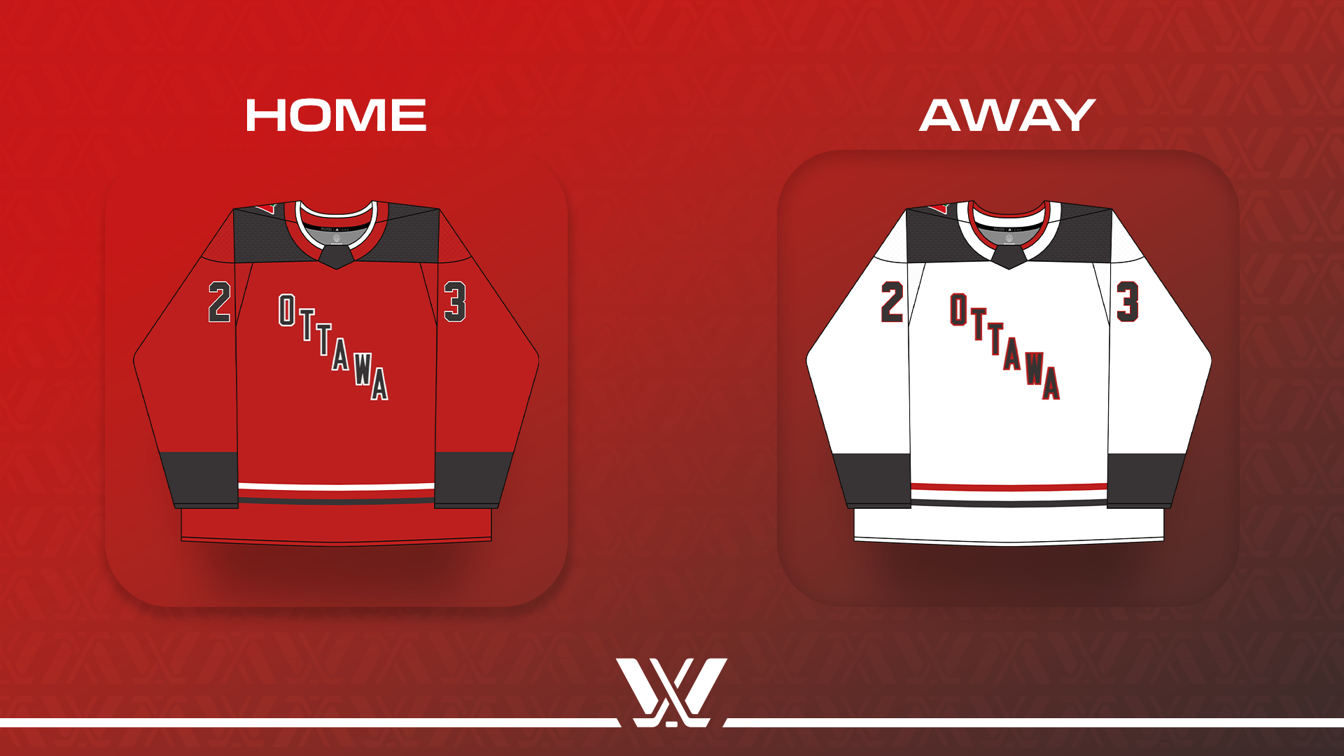
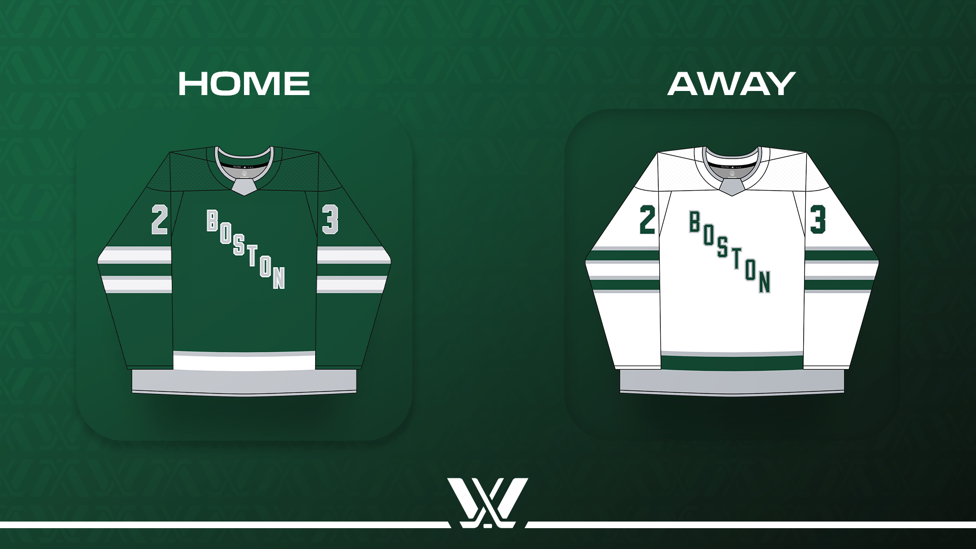
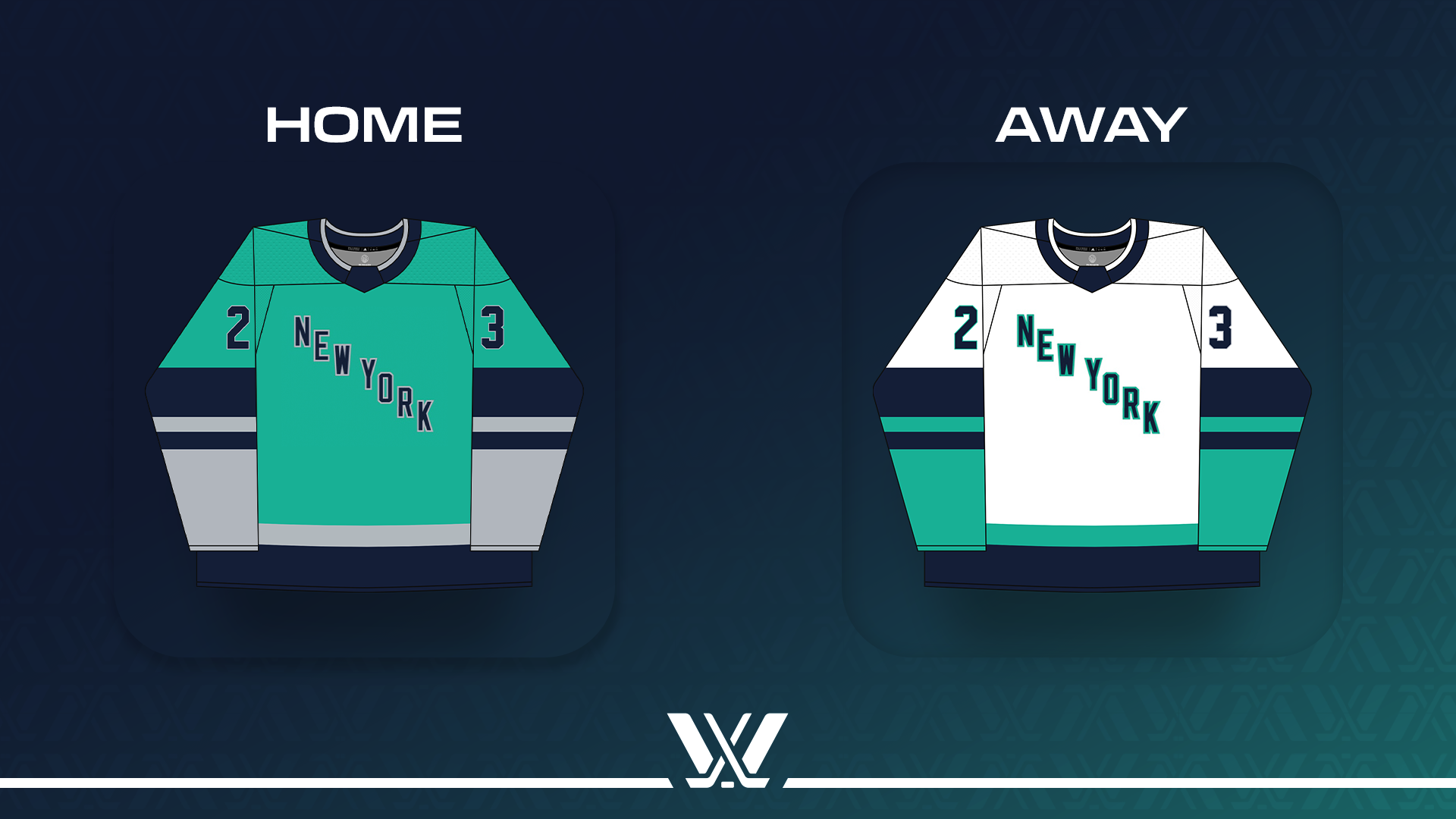
All images via the PWHL
The mock-ups provided vary somewhat compared to the real-life versions modeled by players on November 14 – the colors for Ottawa, Boston, and Minnesota are significantly darker, for example, and the turquoise for New York is more blue than the rendering.
Nothing going on here, just showing off the new fits 🤜🤛 pic.twitter.com/mlcPJtg4a0
— PWHL Ottawa (@PWHL_Ottawa) November 14, 2023
Respect the drip. pic.twitter.com/q739TAimbl
— PWHL New York (@PWHL_NewYork) November 14, 2023
As was first prominently mentioned in a Michael Russo profile of Minnesota GM Natalie Darwitz in The Athletic in early October, having team names and logos before opening night is not really expected. PWHL Board member Stan Kasten more or less confirmed this again in a media availability on November 14.
"I will tell you that for at least the first month or maybe half a season or more, we will have a line of merchandise... featuring city names and variations on some of the designs you've seen so far," he said. "My hope is within a month or two thereafter, maybe we'll be able to supplement that with logo merchandise."
The jerseys we saw on Tuesday are just a first look – so there may be further variation with the versions that players don in January. The Canadian teams will sport patches from sponsor Canadian Tire, and there will be additional patches (both for sponsors and otherwise) on the jerseys as worn in-game. These prototype jerseys (or "sneak peeks" as Kasten said) do have visible issues with stitching, which shouldn't be present on the versions that players actually receive for gameday.
All of this comes back to the timeline. After the Premier Hockey Federation acquisition was finalized in late June 2023, the executives and players for the nascent new league agreed and committed to have a season commence in January 2024. This gave everyone six months to spin up six professional teams – a frankly absurd timeline that, on its face, suggested that there would be some aspects of the inaugural PWHL season that would be more in "first draft" stage than finished. At the same time, expectations are sky-high. The tight turnaround is the source of constant tension, and some compromise.
On a six-month timeline, getting high-quality, embroidered, custom jerseys produced for six teams is a challenge in and of itself. It's not much lead time, and many manufacturers would be unable to turn the project around, if only because they have other uniforms to make which were ordered first. Stan Kasten confirmed this as well in his media availability this week: "We had to order uniforms right away," he said, referring to the period over the summer immediately after the PHF acquisition. "By the time we got this started, every other league had already put their orders in and the big companies were already swamped doing it, so we found someone who could do this. And we did this in maybe early August... once we knew what our cities were. And we opted to go at the time with kind of this vintage look, which we thought was pretty cool. Our players' reactions have been great."
Creative labor to design logos and brand identities, too, takes time – especially if you're engaging established professionals who may have other clients and obligations. That doesn't mean it was impossible to have six brand identities ready in six months, or that fans should be happy with the placeholder jerseys. But with the logistical challenges involved in starting a league from scratch in six months, it may have seemed like the least-important important thing. Kasten also confirmed that the PWHL's new Senior Vice President of Business Operations, Amy Scheer, is currently reviewing the team branding.
The branding isn't materially necessary for league operations – you can still play a hockey game without team names and logos, or continue to work on them while you finalize other, more essential things. But people aren't exactly thrilled with what might be going on behind the scenes on this front, either. When some potential team names were discovered via trademark filings in October, they were also roundly mocked. In the social media sphere, the jerseys and team names have become a sort of referendum on the PWHL itself – potentially indicative of a level of carelessness or unpreparedness that could be wholly discrediting.
The PWHL is, as we all know, the product of a player-led labor action which began four years ago when many of the world's best players refused to play in the PHF due to concerns about professional standards. The PWHPA players – many of whom are now unionized in the PWHL – are seen as directly responsible for the PHF's downfall. Everything that came after is viewed in that context: that something was eliminated to pave the way for what we have now. And especially in the beginning, it will always be framed by the question of Well, was it worth it? The PHF did have seven teams of players and a dedicated fan community. Many of those players have found themselves without roster spots since the league folded, or playing overseas. Many fans still feel that the thing they loved was unceremoniously killed. There's bitterness there that won't be easily soothed.
And the PHF did have brands. For my own part, most of them weren't brands I particularly liked (though the Connecticut Whale consistently had my favorite sock designs in all of hockey). But each of the seven PHF team brands was visually distinctive and executed with enthusiasm, and they were obviously beloved by women's hockey fans.
When I saw the PWHL jerseys, my initial thought was that I liked the designs and the color choices – I'm a minimalist at heart and I love classic, simple hockey sweaters and diagonal lettering. They also aligned with my expectations for what the league's Year One would look like. Also, good branding can cover up a litany of sins, and as media, there's been something refreshing about getting to see more of the raw product, with less artifice. Rough around the edges isn't always bad.
But that hasn't been good enough for a women's hockey community that has been forced to work with low expectations for so many years. There have been proclamations that the PWHL should have just re-used the PHF brands (which they really can't) or shouldn't have launched in January at all if they weren't prepared to do so with team branding. (Would everyone involved have accepted going over one calendar year without a North American professional league at this stage? I don't know the answer to that question.)
While the branding doesn't matter to me, I'm not the person the PWHL front office has to convince on this. Nor are the players – up until this point, it's been all about them, and that shows if you're paying attention. To date and across all six teams, the league has hired world-class staff and secured high-end practice facilities. They conducted the biggest professional draft in women's hockey history and each team has a wealth of talent at training camps kicking off this week, both drafted and undrafted. There is a collective bargaining agreement in place to ensure the ownership fulfills obligations to the players – a first in women's hockey, and the first known CBA in North American professional sports history to be in place before beginning operations. From the hockey ops side, everything seems to be going well. Training camps are underway, and there's a lot of media and fan interest. The players are already benefiting.
But not everyone knows about the behind-the-scenes struggle to get to this point. And for those who do, and know it intimately, every misstep is going to feel like Oh shit, here we go again, whether because of the thing itself or the discourse around it. We have had two major North American women's hockey leagues fold in the last five years. Every little thing counts if the PWHL is to deliver on its promise to be the league that is here forever. They will need to make money. They will need to market themselves well and appeal to a wide swath of fans – not just woho lifers, but people who are new to hockey, people who are new to non-NHL hockey, people who are new to women's hockey. The team branding will need to be part of that.
These jerseys are going to get the basic job done – they'll have numbers and nameplates and will provide a visual distinction between teams on the ice. Hopefully they will also be functional and comfortable for the players. But what they won't do is reliably capture the imaginations of fans. While I don't think this is the unmitigated disaster that some are making it out to be, I know the league is going to have to do better and prioritize their branding going forward. The social media comments have been rough to see, especially derisive ones directed at players, who are the people who deserve them the least.
The CWHL and PHF didn't fold because of branding, at the end of the day. They had some good branding, but they also had much more serious and intractable issues. Even so, people in the women's hockey community believed in each of them for many years, and wanted to believe in them. They weren't dead on arrival, and they got a lot of chances to make mistakes with things that were deeply consequential. In their early years, or during times of transition, they were frequently defended because we believed these mistakes were part of the growing pains and learning processes that could make the sport better. I wouldn't go so far as to say the PWHL Board deserves grace on this, but I do think it's important to view what's happened with a sense of proportion. Long-term success isn't necessarily about getting everything perfect the first time. It's more about how you evolve.
As I've sat with it the last few days, I think I've come to understand why this is so frustrating. Women's hockey has been so woefully behind where other major women's sports are in terms of salaries and exposure. When there's a new WNBA or NWSL expansion team, we learn about it with years of lead time; we get slick marketing and beautiful, finished kit. We keep speedrunning women's hockey for some reason, though. This time, the timing feels especially urgent. We're getting another Winter Olympics in 2026, and the PWHL ownership group wants its elite pro league well established and on television before the most-watched women's hockey tournament in the world drops the puck. And if this fails, the weight of the wasted potential will keep us from having another chance like this anytime soon.
We are desperate for hockey to catch up because this is the biggest women's sports have ever been, globally. The stakes are high and everything that isn't perfect is going to feel like a raw nerve. Now is the time to get it right. But I don't think the jerseys and logos are enough to sink the entire operation before it gets off the dock. If they are, then so much else has already gone wrong. We know that the players have more support and resources in place than ever before. Based on that fact, I genuinely believe the sport is in a better position to succeed than it has ever been before. And I want to see what comes next.
(Photo: PWHL Montreal)
