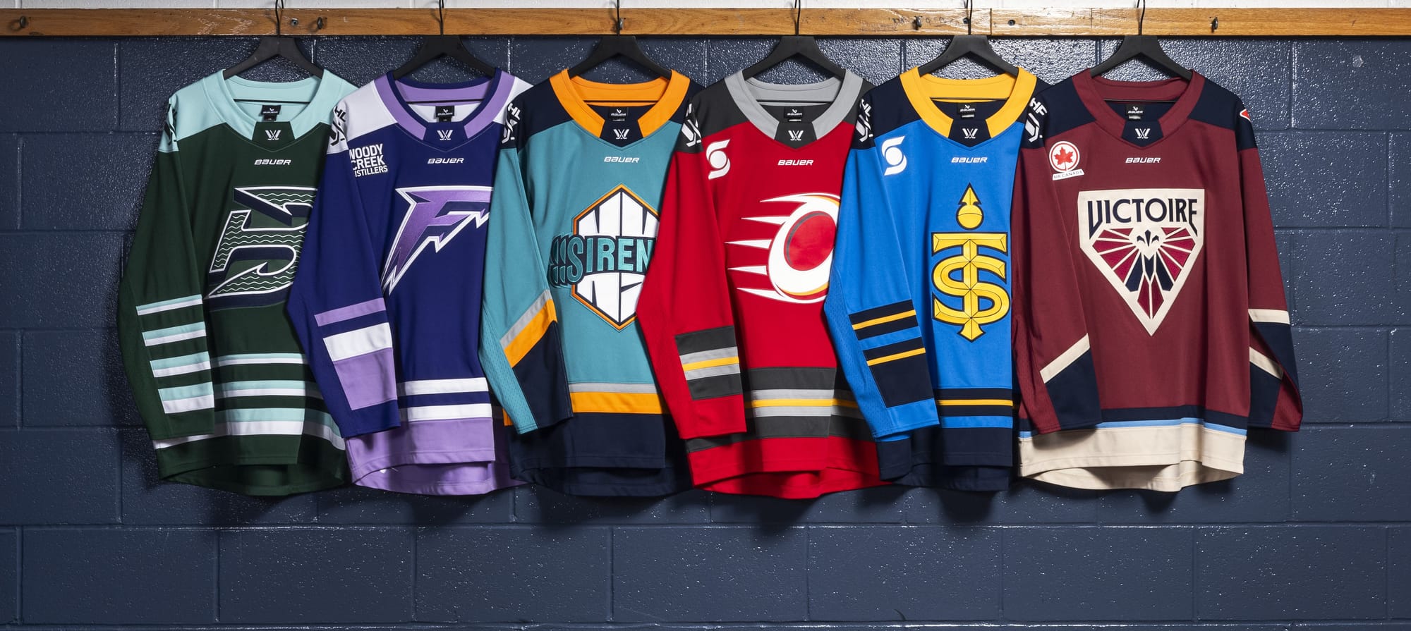
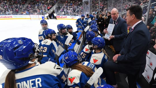
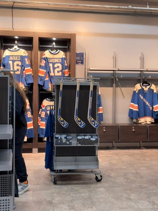
As we get closer to opening night for the PWHL season, all six teams unveiled their home and away jerseys featuring the logos and other visual identity elements announced last month.
Naturally, we have thoughts.
We created a collage for each team so you can see each of the elements we discuss. The italics are the promo copy each team used to introduce the uniforms.
Let’s start with the elements that are incorporated in each uniform: the tiny icon-like graphics inside the numbers on the back of the jersey and the arm stripes.
Liz Koetting: The graphics in the numbers are so neat, but they definitely work better for some teams than others. For example I love the red-on-white of the Charge’s away jersey numbers, the shape of those little graphics work well with not being centered inside of the font, and the fleur de lis for Montreal are so good, whereas the waves for Boston look weird being offset like they are, and I think it’s because they’re more uniform in shape so my eye expects them to be centered? In re: the arm stripes, I think we’re all in agreement that it’s annoying that the arm stripes don’t go all the way around.
Nicole Haase: Modern jersey design is often riddled with superfluous elements, but the graphics in the numbers are subtle and add some personality without going overboard. What will be interesting is if any of them are even visible from the stands or on broadcasts. I’d imagine the minimalism of the Fleet’s waves will all but disappear in that context.
I HATE that the stripes don’t go all the way around the arm. I get the jersey construction makes it difficult, but then the design needs to account for that! Design can’t be all concept or conceived in one dimension when the final product is 3D. They are stripes to nowhere and it drives me bonkers.
Sam Gray: I love the little details in the numbers! Surely many will disappear on broadcast but, I don’t know, it will be fun to see if it creates the dimension from that distance/through a screen. I will be honest I did not notice that those arm stripes did not go all the way around and I’m, um, neutral on it. I guess it’s annoying but I don’t feel that strongly about it (at this time). I’m excited to see what all the jerseys look like on the ice. That’s another context that changes things.
Boston Fleet
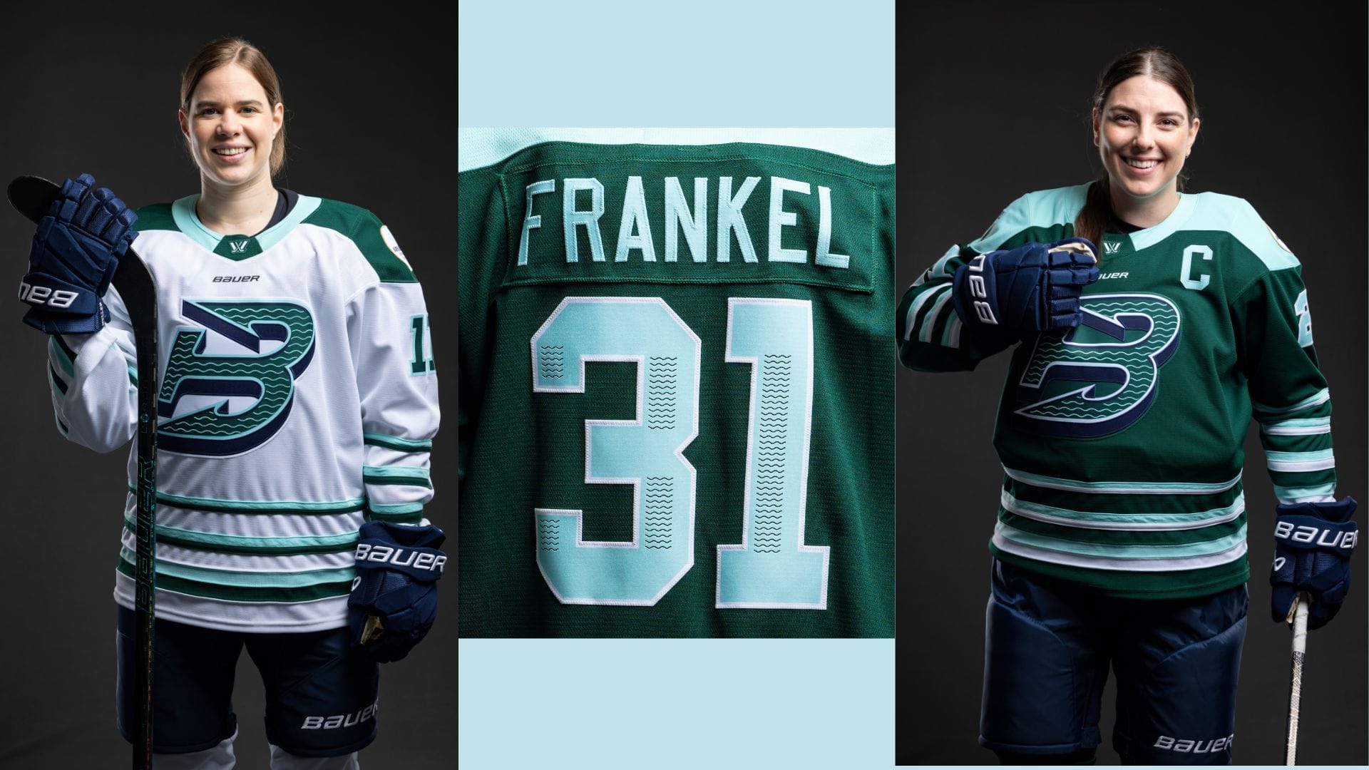
Anchored by the team’s signature “B” across the chest, the Fleet’s home jersey features a deep green base, complemented by oceanic blue accents on the shoulders, sleeve stripes, and waist. The classic hockey design incorporates alternating bands of color, forming a wave-like pattern that evokes a strong connection to the sea. The numbers on Boston’s jersey carry a unique wave motif inspired by the crest, further reinforcing its maritime heritage.
LK: This logo is still SO FREAKING GOOD, and looks even sharper on the home jerseys. Though I don’t love that they made the pants and gloves navy; yes I get that navy is an accent color, and the whole theme is sort of naval, but I don’t think it’s enough to make the pants/gloves look like they fit. The size gradient of the hoops/stripes at the bottom is really eye-catching, but it also draws attention to the way they’re sewn on, which looks kind of cheap to me.
NH: I had no strong feelings about the Fleet logo when it was released. I didn’t love it or hate it and as a non-NHL person, had no big Whaler-related feelings. But I think they did the best job of taking their name and logo and extrapolating a full look, which I don’t think was a given having just seen the logo on its own.
Based on comments I saw on Twitter when the jerseys dropped, I might be in the minority, but I LOVE all the stripes (or hoops, in uniform lingo). The jersey has some oldtimey sweater vibes for me, which works with the whole fisherperson, Whalers throwback, grizzled sailor in the northeast thing they have going. I’m generally a fan of simpler design so I like that they’re simple hoops, but done in a way that no one else has. I’d love to get a better grasp on how all the colors play together by seeing them in person, but my initial reaction is that the lighter blue/minty green color really pops on the dark green.
SG: I like these. I do agree that the gloves OR the pants should be navy but not both. I like the navy with the crisp white away jerseys though. Also, yes, the stripes – hoops, I suppose. I like them. I like the look of them but yeah, to Liz’s point, they are sewn on in a way that makes they jersey fit kind of awkwardly on every player in the promo pics.
Minnesota Frost
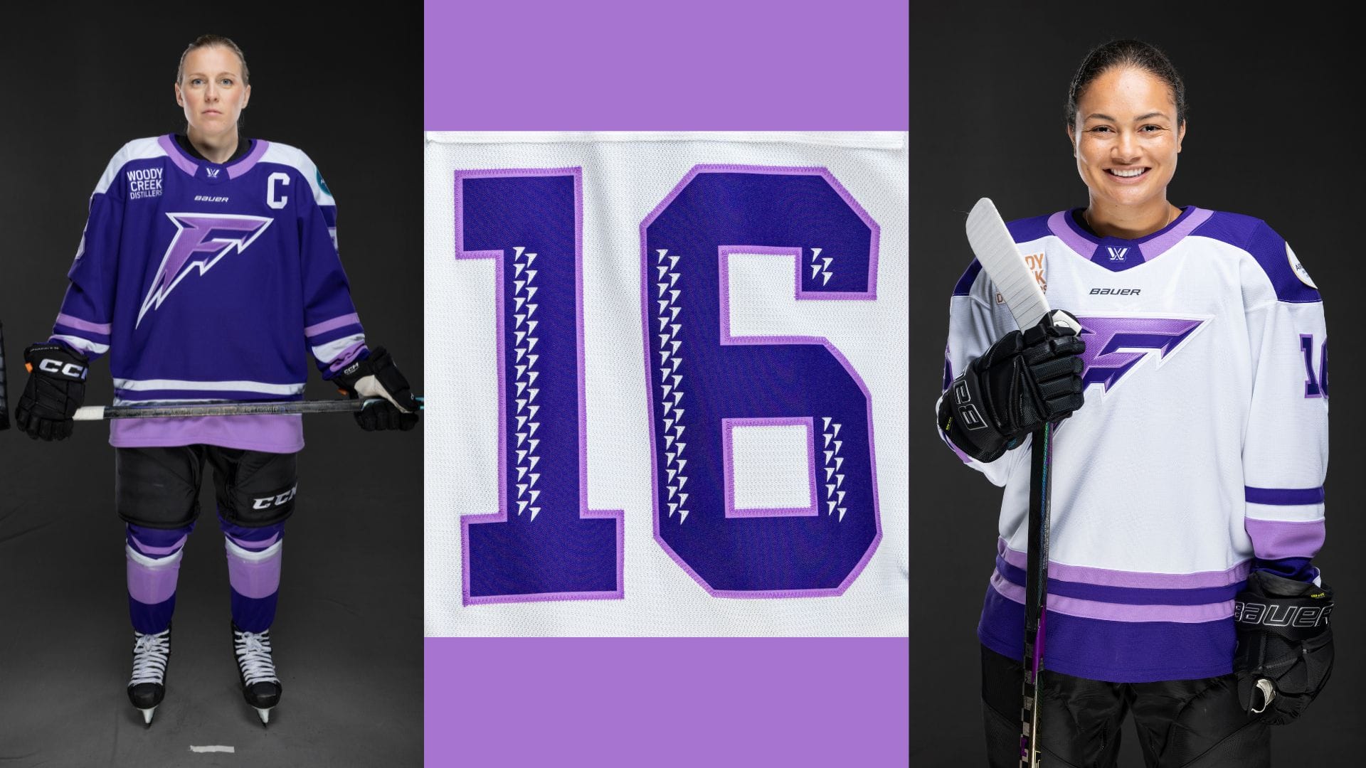
The Frost’s home jersey embraces the chill with a deep purple base that channels the spirit of Minnesota winters. White accents on the shoulders, arms, and waist add a crisp, icy contrast, capturing the sharpness of the frozen landscape. Light purple details introduce a modern touch, blending seamlessly to create a layered, frosted look that embodies both the intensity and elegance of the Frost on the ice. The jersey numbers feature a motif inspired by the shape of the team’s crest, bringing a distinct edge to the design.
LK: There is waaaaay too much negative space at the bottom right (when you’re looking at it) of these jerseys. Why is the logo placed so darn high????? I do still adore this color scheme though, and I will be asking for merch for Christmas. Also, the bottom of the jersey stripes here are better than Boston’s. I love that lavender. And is the F shiny? Because that is cute.
NH: And here we come to the disconnect between the very cool jagged F logo and how lost and unbalanced it looks on the front of the jersey. Honestly, this jersey reveal made me think the logo needs some tweaks or reimagining. Maybe Frost needs to be written out. Maybe it needs to go inside a crest. We’ve reached the end of my design capabilities, but the point is that it needs spacial balance because right now there’s just a whole lot of blank jersey toward the wearers’ left hip and it’s especially bad on the white jersey. I’d also love to see a color swapped logo on the white jersey where the dark purple is the main color and the lavender is the drop shadow since the lavender-forward logo does not pop off the white in the same way.
I’m not sold on the accent colors every team went with, but absolutely love the lavender here, particularly because I think the use of the pastel teal by the WNBA’s New York Liberty and NWSL’s Gotham FC has shown the marketing and merchandising possibilities of an additional color like that. And in that same vein, I don’t love the colored collar on every jersey, but think its a perfect use of the lavender here.
SG: Great Qs, Liz! Why IS the logo so high on the front? I adore the logo on it’s own, but did we even think about what it would look like on a jersey when we were ideating? By we I mean whoever was in charge of that! Like what is that blank space? What are we going to do? The open space makes me feel bereft.
I… don’t like the black pants and gloves with either jersey, honestly, but I also don’t know what I’d like better.
NH: Good point on the black pants and gloves - it does look really harsh against these jerseys, but I agree that I have no idea what the answer is.
Montréal Victoire
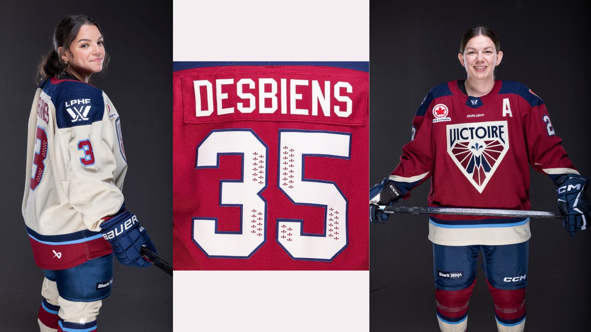
Anchored by the burgundy base, the Victoire’s home jersey reflects Montréal’s timeless elegance and strength. The navy shoulders and dynamic sleeve design draw inspiration from the angular lines of the team’s crest, adding a sense of movement and precision. A bright blue stripe accents the overall design, providing a vivid contrast while maintaining a classic style that honours the heritage of both the city, the team and the province. The jersey numbers are adorned with a Fleur-de-lys motif, reinforcing Montréal’s cultural pride.
Montréal remains the only team in the PWHL to don a cream-coloured jersey for road games.
LK: I still hate how much I love this logo/color scheme, but on the jerseys I’ll say the light blue is sort of jarring. Because the palette is pretty somber otherwise, it just sticks out in a not great way. I do love that they went with a cream away jersey versus a white one. Not only does it make sense for their look and their story, it’s just so sharp. How come their shorts and gloves get to match their jerseys so well though? Annoying. Heh.
NH: There was never a doubt in my mind that this logo and color scheme would translate well into jerseys. Their logo and branding were already a vibe, so this isn’t a huge leap. I love that they went huge with the logo on the front and that they stuck with the non-white road jersey they had in the first season. The whole Victoire aura is classic, which I think is why I hate the neon light blue, particularly on the burgundy jersey. I think the number outline on the cream will absolutely get lost under stadium lights and on camera for broadcasts, but I appreciate finding more places to try and use the accent color because that lone stripe on the home jersey looks like a little lost mistake. I think there was a way to do an accent here that I wouldn’t dislike so much, but the palette was giving Crayola Bold Markers and this is like a Neon marker got put back in the wrong box. No one asked, but I actually think something like old gold would be a really good accent color for this look.
SG: I looooove them. Like, WOW. Insert heart eyes emoji. How annoying! And, me, the dissenter: the light blue accent doesn’t bother me. I might even like it. I’m excited to watch all of these in action so we can come back and see how wrong we were about what does and doesn’t look good on ice/TV. Oh AND I love the cream away jersey sooo much!
New York Sirens
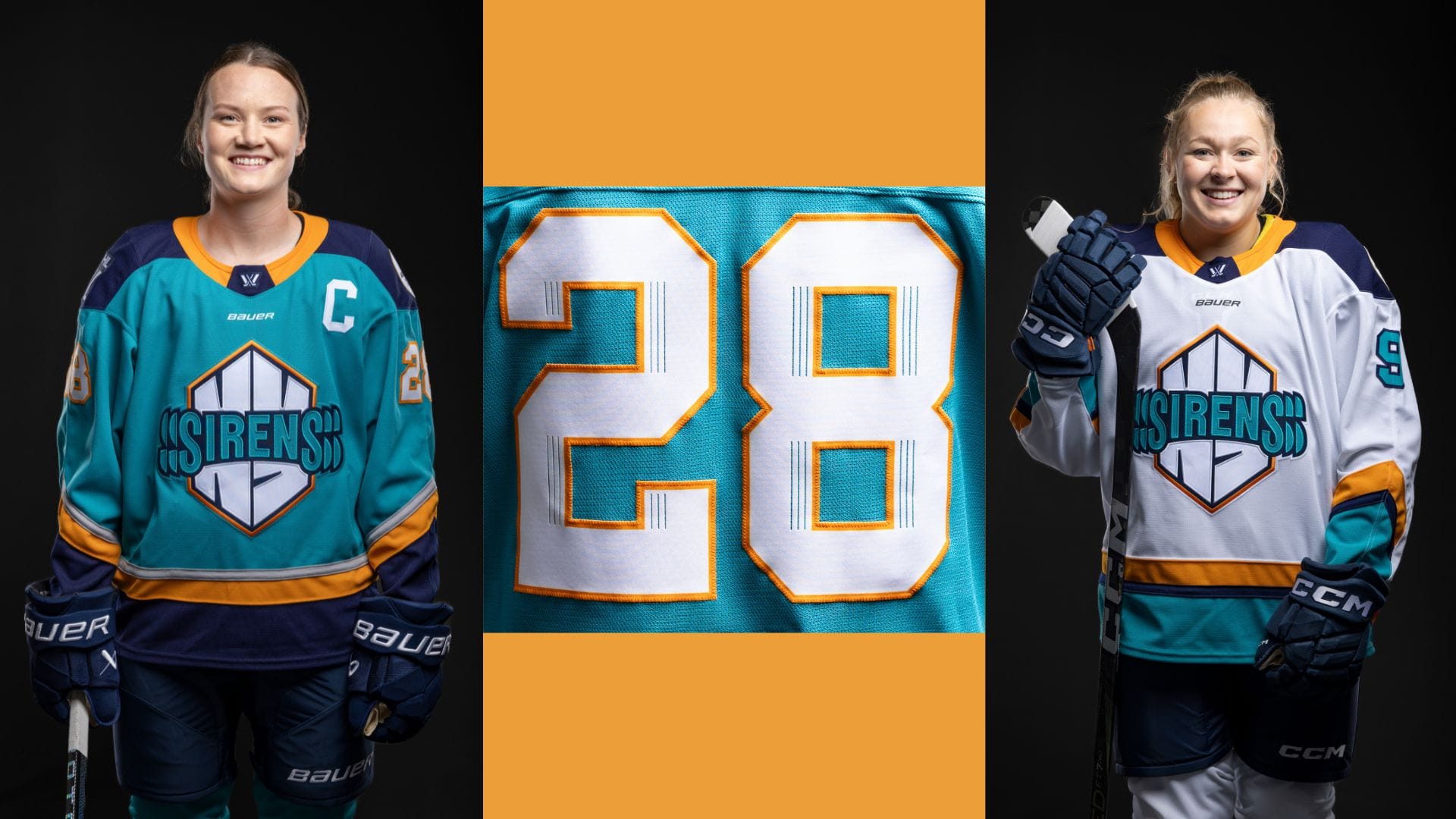
The New York Sirens jerseys are inspired by the hexagonal shape of the team crest. The Sirens’ home jersey captures the spirit of New York’s multifaceted energy. Angular sleeve stripes, echoing the crest’s geometric form, combine the city’s signature navy, orange, and grey hues, creating a striking, modern motif. The lower waist reflects the same hexagonal pattern, grounding the design in New York’s intense and dynamic identity. The numbers on New York’s jersey feature linework inspired by sound vibrations, echoing the city’s constant hum and buzz.
LK: I will say, the motion sickness inducing logo looks better on the jersey than it does by itself. I still don’t like it, but that’s fine. The colors are too good to be too mad.
SG: You’ll get there.
NH: Agreed, the logo looks way better on the jersey than it does standing alone. However, the more I stare at it, the more it looks like the “cool S” I doodled in my notebooks in middle school.
The description of mimicking the shape made me appreciate that both New York and Montréal created continuity from their logos with their diagonal sleeve colors/stripes. That’s cool attention to detail.
The vibes on this color scheme are somewhere between old school Mighty Ducks and New York Islanders and I don’t hate it. The press photos make it look like the orange collar and stripe on the white jersey are different shades, which is something that would drive me nuts, if true. In the photos, the gray looks superfluous and gets really lost. I love the idea of it and hope it works better than it’s photographing. For all my nitpicking on details, I want to shout out how well the arm and jersey stripes line up on Micah Zandee-Hart. Chef’s kiss.
SG: My beloved Sirens. These are fun as hell! Very much giving vibes like every night is 90s night. The number details with definitely get lost from afar, I can barely see them in the photos. For the home jersey, I don’t love that the bottom chunk of color matches the pants. I wish they’d done something different there.
I will say I disagree about the gray being superfluous. I think it breaks up the brights pretty well.
Do I want orange gloves? But then they’d have to change the striping on the arms. Maybe like an orange third jersey? Sirens, call me.
NH: Ohhhh, I like how you think!
Ottawa Charge
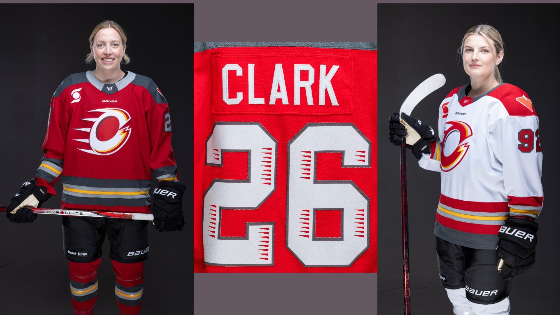
The Ottawa Charge’s home jersey energizes the ice with its vibrant red base, embodying Ottawa’s unyielding drive. Dark and light grey bands run across the sleeves and waist, adding depth and a sense of momentum, while a bold pop of electric yellow pulses through the design. The overall look captures the energy and intensity that defines the Charge’s fierce presence on the ice. Custom numbers on the jersey incorporate small electrical charges, adding a spark to the back of the jersey.
LK: This logo also looks better on the jersey than it did on its own, and ESPECIALLY on the away jerseys. That red on the white is so sharp. On the red jersey, the light gray comes off too cool-toned, but it works on the white jersey. I will say though, their stripes look like a street with lane lines painted on and now that I’ve seen it I won’t be able to unsee it.
NH: Welp, that’s absolutely unseeable now. Is it wrong to think a detail like that would have worked really well for New York? They can call that color “electric yellow” but it doesn’t make it less lane-line yellow, particularly on top of what I'm now thinking of as pavement gray.
I think these are fine and they were never going to be more than fine because of the underwhelming logo. The total look is probably better than the sum of its parts based on what they were working with and I really love the choice of charcoal over black. But the light gray kind of muddies those waters and I wish it wasn’t there, particularly on the collar of the home jersey where it ends up looking like an actual dress shirt collar sticking out of a sweater. Formal hockey wear, I guess?
SG: Not pavement gray!
Yeah, logo looks much better on the jersey than on its own. I love the white-on-red number details of the away jersey. Pavement gray aside, I think the red will look really sharp on the ice.
NH: For all my teasing about the pavement gray, imagine how amazing this would look with charcoal pants and gloves. Bauer, please make this happen.
Toronto Sceptres
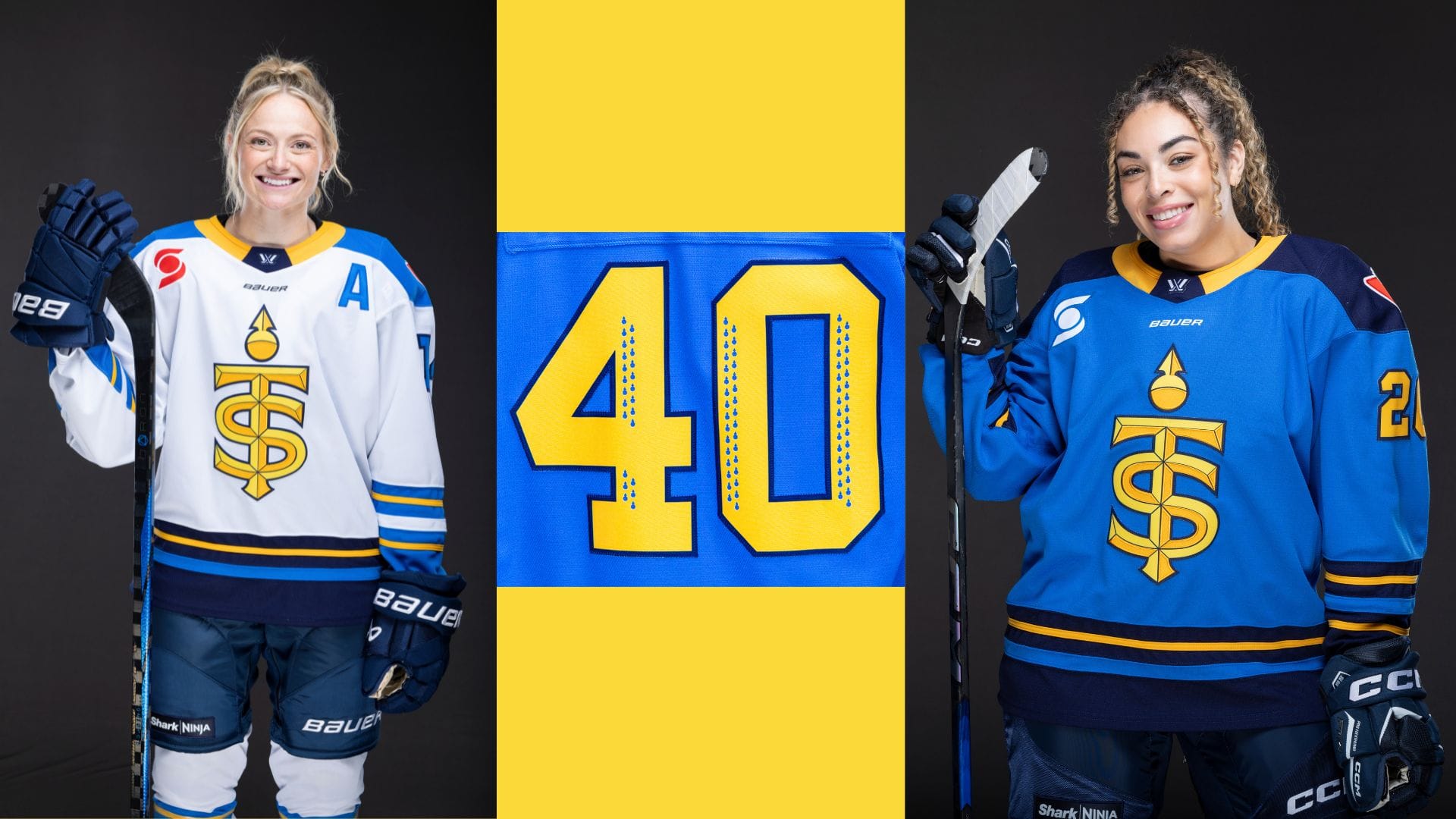
The Sceptres’ home jersey reflects a modern, confident Toronto, with a rich blue base that captures the city’s leadership and pride. Navy paneling along the sleeves and waist brings depth and contrast, while clean, precise yellow lines and a matching collar add sharp, dynamic details. The striking gold and yellow of the team crest stands out, creating a look with bold presence, embodying the energy and spirit of Toronto fans. Custom numbers nod to the Sceptres’ crest design.
LK: My first thought was “these look so basic,” but also this is the first set of uniforms where no color looks out of place to me. However, the little graphics in the numbers look like pineapples. I don’t think those are having quite the effect they intended.
NH: I have lots of quick thoughts on this one. When I saw the blue jersey I was ready to call these perfect in terms of not having any quibbles - as Liz said, there’s nothing that looks out of place. Then I got to the white jersey and why, oh why do the arm stripes differ from the stripe at the bottom of the jersey? I hate it. I am actively mad about that decision and can’t talk about it anymore.
The Sceptres did a full editorial/fashion video for this roll out and I loved the jerseys being used as street style and as part of a bigger image from the get go.
I don’t love the navy at the bottom as it just blends into the pants. Switching up the order of the striping at the bottom of the body might have made for a more interesting look. In a lot of photos, the jersey ends up looking almost cropped, or cut right at the waist because those bottom few inches disappear.
SG: Yes see! It’s weird!
NH: It's interesting that I noticed it here and not so much with the Sirens, but yes, it's a problem.
The longer I stare at the logo on the blue jersey, the more the repetition of the joins looks like a braid to me and now I want to see the first person to recreate this in their hair.
SG: I feel I am just hypnotized by this shade of blue. Something about these is giving baseball? Not in a bad way. I don’t know what that detail on the number is supposed to be. I did NOT notice the different arms stripes until Nicole called it out and wow that’s wild! Why did they do that? Oh no, I will have to block it out now. Thanks for that.
NH: It's what I do.
Personal opinions aside, it's very cool to see all the ways in which the teams included design elements that tied the threads through the whole league. The PWHL has come a long way from the hand-wringing about last season's basic jerseys and the leaked registered team names.
This was an awesome coordinated roll out and the teams did a great job with their individual videos and intro posts. It's probably unfair, but the names, logos and jerseys really make this all feel legit and real in an enhanced way. We truly aren't that removed from not being able to conceive of this league and it's an absolute delight to be in a place where we're nitpicking jersey number logo details and anticipating the season opener.
