There were a lot of snap judgements when the PWHL announced new brand identities for their six teams on September 9. Now that we've had time to sit with them a bit, we're grading the logos and giving our thoughts on names, colors and more.
Each team's introductory news release is linked below. We have shared a bit of the explanation the teams provided for the choices that were made is in italics under their logo, followed by our thoughts and grades for each one.
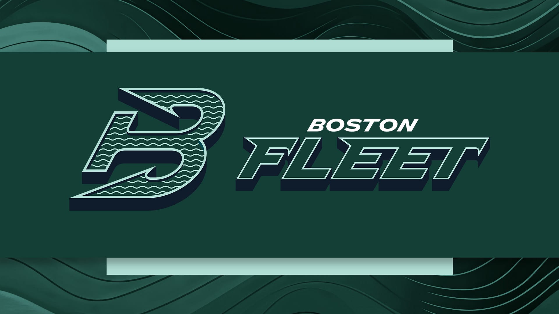
The team’s name ‘Fleet’ pays homage to Boston’s collective spirit and rich maritime history, representing the city’s unified strength and resilience. The logo combines the iconic letter ‘B’ with an anchor, symbolizing Boston’s identity, and nautical heritage. The forward-leaning shape communicates momentum, reflecting the city’s sporting legacy and the team’s advancement on the ice. The color palette, centered around the team’s primary deep green, includes supporting accents of nautical greens and oceanic blues that reflect the sea’s dynamic hues.
Sam Gray: I’m biased against all Boston teams. But I’ll put that on hold for this, because both the name and the logo are badass. I love the complexity of the logo: combo of the B, an anchor, the waves inside the letter. The assumed callback to the Whalers? Perfection. The unifying vibes of "Fleet" are fun and I do love a nautical motif.
Grade: B-
Liz Koetting: I’m actually mad at how much I like this logo. I’m also mad that I didn’t realize it was a sideways anchor until the announcement pointed it out to me. I thought it was like a pier in a marina! My fave part is actually the multiple meanings of the word fleet; we all know that women’s hockey is fast and skilled, and this name celebrates that.
Grade: B+
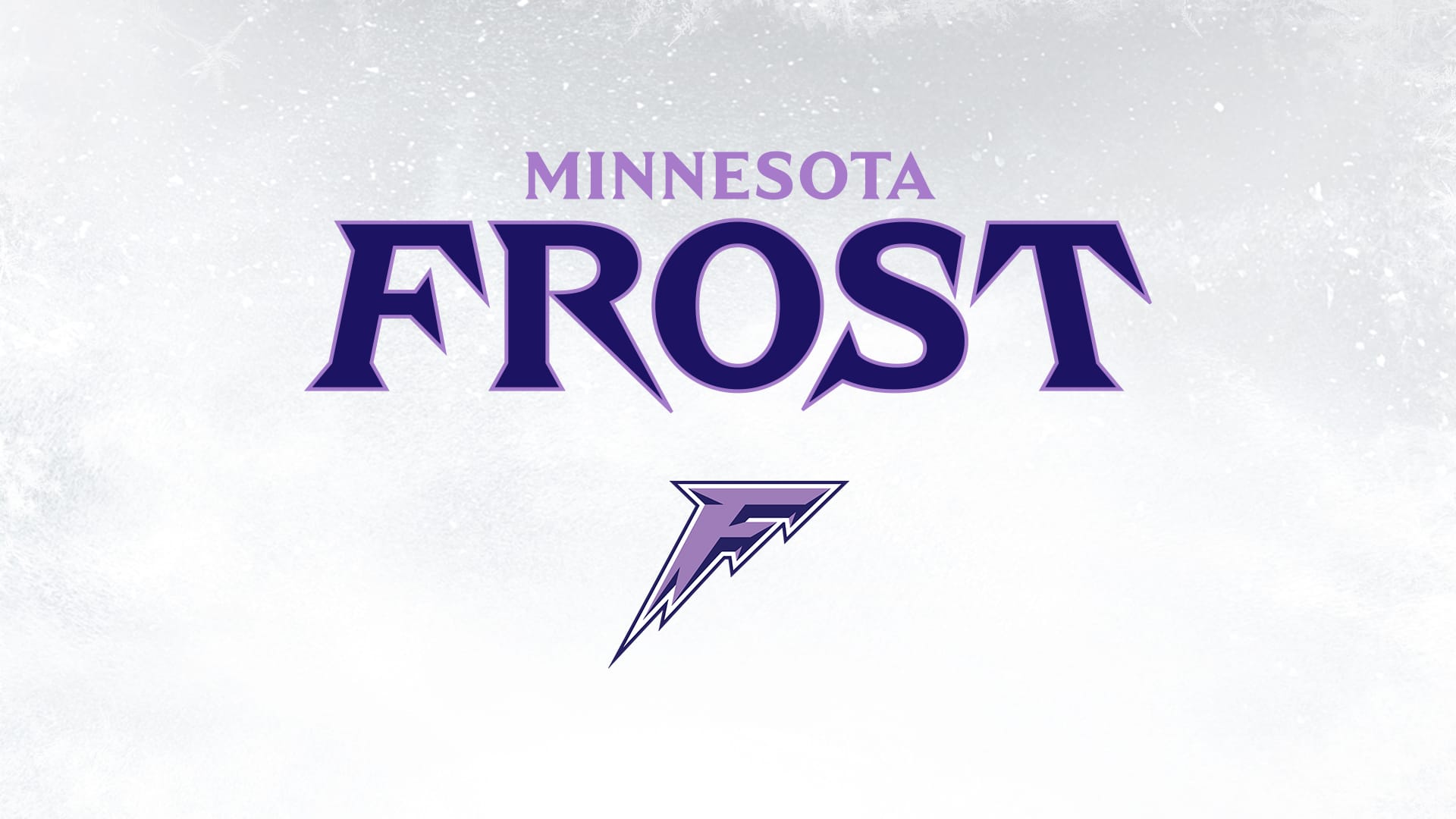
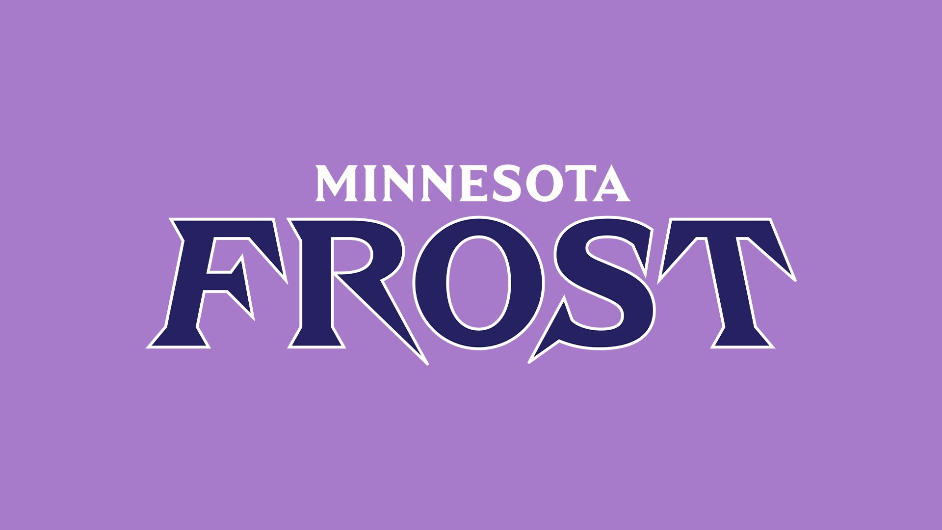
The team’s name ‘Frost’ embodies the State of Hockey’s deep-rooted love for the ice— and the sport that has become a timeless tradition, bridging generations. The logo features a stylized letter ‘F’ with angular edges and sharp points, reminiscent of icicles, while the overall design conveys a sense of competitive intensity and fierceness. The color palette, centered around the team’s deep, midnight purple, is complemented by accents of lilac, icy blues, and blizzarding whites, which add depth and dimension to the scheme.
SG: I LOVE it. Although the logo vaguely reminds me of the Montreal Force of the PHF, I love the icy angles on it. The name ‘Frost’ reminds me a bit of, like, mythical creatures creeping up on you as the frost rolls in. That unseen, unknown enemy. Maybe it’s remnants from my Game of Thrones days, but it’s pretty menacing. Intimidating. Also, we need more purple in hockey. I think this one is my favorite (don’t tell the Sirens).
Grade: A
LK: Ob. Sessed. Not just because this is my team, or because purple is my favorite color, but because I really feel like the whole concept FITS the location. It’s excellent when it feels like a sports team fully understands and embraces their home, and leans into it. For SURE want a cryptid mascot. In fact, I saw a dancing sasquatch TikTok the other day that fits the bill …
Grade: A
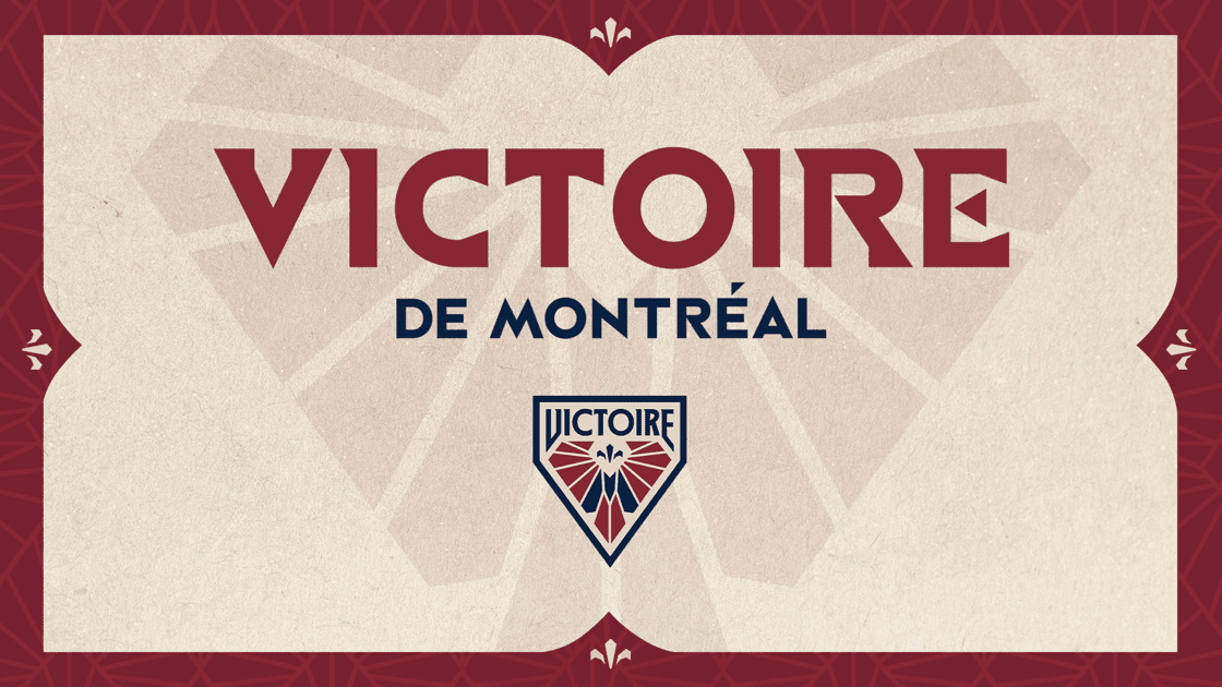
‘Victoire’ embodies Montréal’s joyously competitive spirit, acting as inspiration for the city to climb to even greater sporting heights. Win or lose, ‘Victoire’ is a mindset, celebrating the city’s pursuit of achievement. The logo features wing-like shapes in the team’s signature deep burgundy color, subtly alluding to the Goddess of Victory and symbolizing strength and agility. A hidden ‘M’ within the wings pays homage to Greater Montréal. Additionally, a fleur-de-lis, a national symbol of Québec, is gracefully integrated and evokes the rich cultural history of the province and the city. )
SG: It’s giving Valkyrie! And goddess. I love a bold statement akin to “we are winning.” It’s the kind of thing that can give players and fans confidence and attitude. Although their stacked roster does that pretty well on its own. The incorporation of the fleur-de-lis is excellent and I know Montreal fans appreciate its appearance along with the deep blue ‘M’ in the middle of the logo. Plus, you can make a V with your fingers and that’s cool.
Grade: B+
LK: This is for sure one of those instances of “clearly well done, but not for me.” If I was grading solely on personal taste I think I’d give it a B- or even a C, because it feels too formal I think? Or maybe the color palette is too subdued? However, it’s perfect for Montreal, and as I just said, I love it when a team fully understands where it’s located. Sam’s point about the victory V is great, too.
Grade: B
SG: Yeah, too formal sounds right. But fitting.
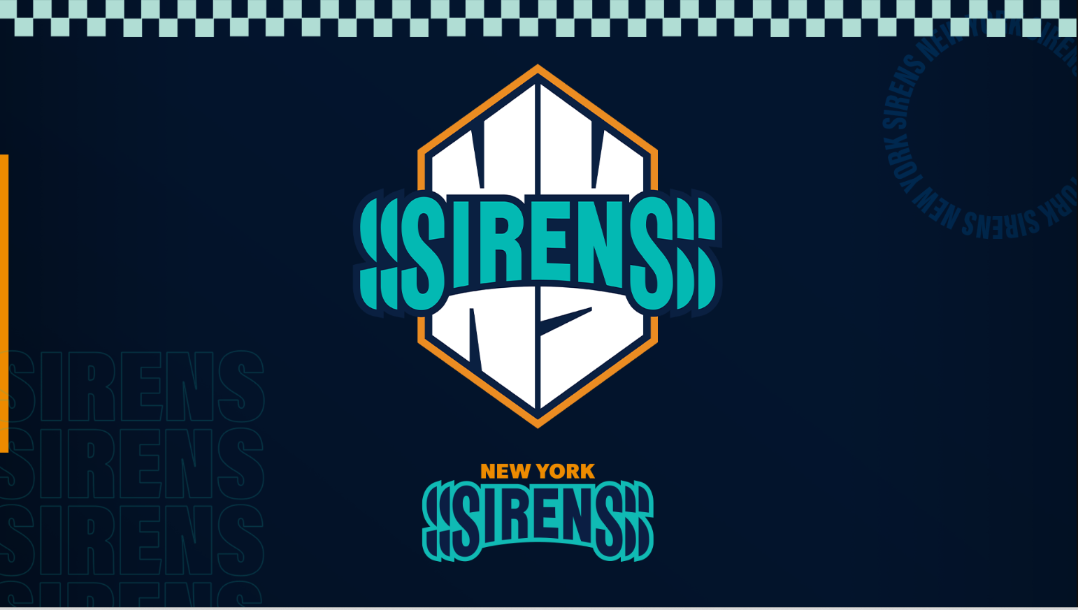
The team’s name ‘Sirens’ is an ode to New York City’s one-of-a-kind energy, pace and rhythm – embodying the City’s sounds and people. Sirens also speaks to the sweet sound of the goal horn after the puck goes into the net. The logo, dominated by the team’s vibrant teal, reflects the intensity of New York and evokes the gritty cityscape. The reverberating ‘S’ visually mimics sound waves, and the angular design of the ‘NY’ pays homage to New York’s iconic architecture. The color palette, centered around the team’s primary teal, is supported by a deep dark blue and a bold orange, reflecting the exhilarating sights and sounds of the city that inspired the team’s name.
SG: This is my team, so of course the name and colors and logo are perfect. That being said, I know I’m not the only one who excitedly thought of mythical temptresses luring sailors to their deaths only to find out that’s not quite what they meant by Sirens. I absolutely love the addition of the orange and blue, which I think adds an element of fun. The way the word "Sirens" bands across the inflated NY in the logo is cartoonish, youthful in a way.
Grade: A-
LK: I really wanted to love this one, but alas. The echo of the S drives me bonkers. It actually hurts my eyes a little to look at. The name itself is so good, again because of the multiple meanings (although honestly hilarious to be like “yeah our city is nonstop emergency vehicles,” I guess at least they’re not the New York Car Horns). And I adooooore the blue that New York uses, but sadly the logo is a miss for me.
Grade: C-
SG: Rude.
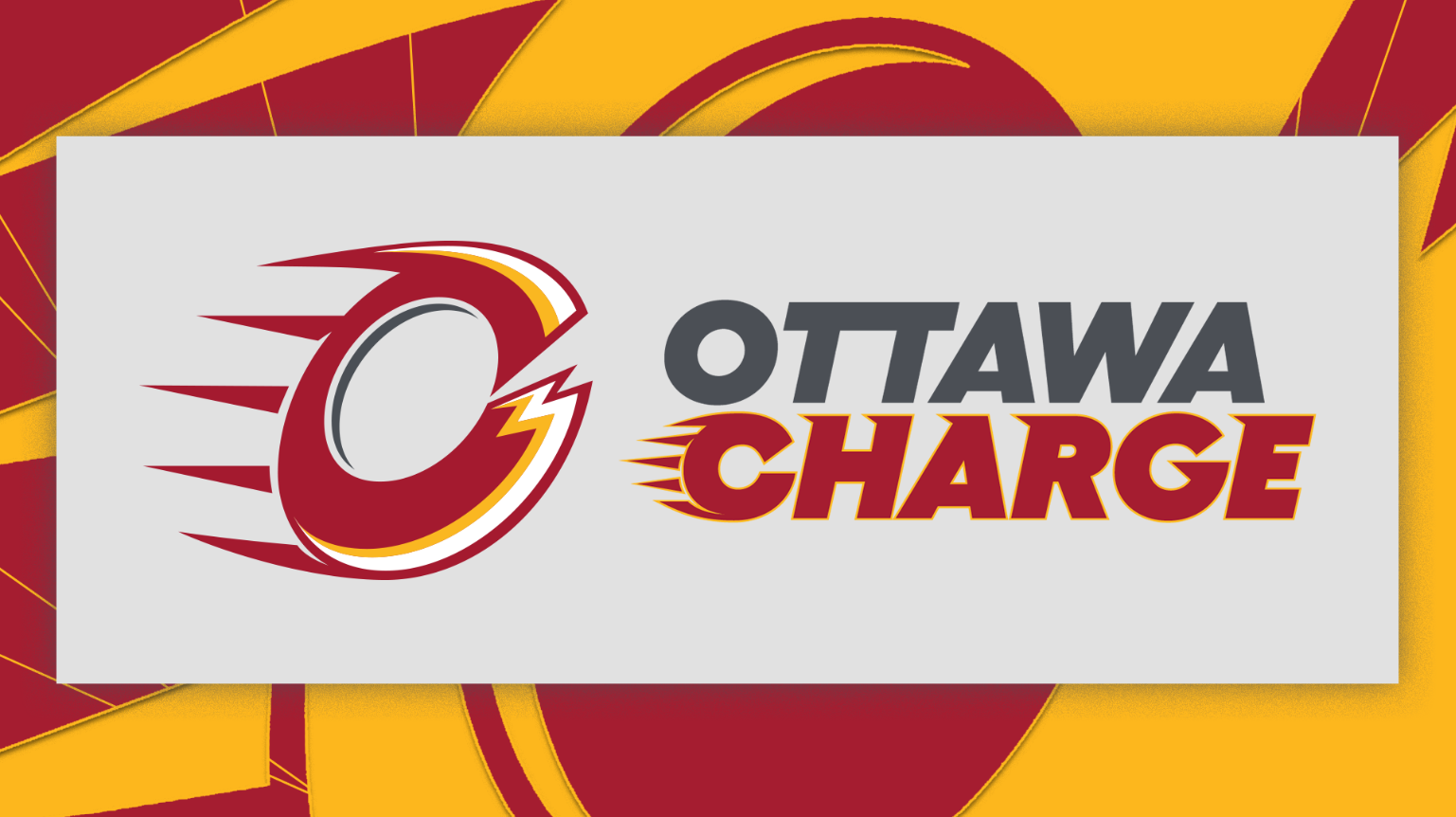
‘Charge’ pays tribute to Ottawa itself: from the city’s motto “Advance” (“En Avant”), nodding to its constant state of dynamic growth and forward progress as Canada’s Capital City. The logo features a monogram ‘O’ designed to convey a sense of energy and movement. The ‘O’ is crafted to resemble a spinning object brimming with electrical current, representing the intensity and power that the fans bring to every game. Spikes radiating from the back of the “O” emphasize forward momentum and the spirit of the city. A faceted cut in the front of the ‘O’ introduces a slight nod to the letter ‘C’, linking the design back to the team’s name, ‘Charge’. The colour palette, anchored by the team’s bold and vibrant red, is complemented by a spectrum of greys, while a pop of bright yellow adds dynamic contrast.
SG: I do love a city motto, so the ‘Charge’ name is a pretty cool nod to that. In reading and re-reading the description I just don’t think I see the whole "O" and "C" of it. It seems like it’s doing too much, but also not enough. I like the wordplay of charge=advance and charge=electrify, and the hype video makes great use of the latter. I will just mention that it looks pretty similar to the NHL’s Calgary Flames–which isn’t necessarily good or bad, but is a fact.
Grade: C (uh, no pun intended).
LK: Way too similar to the Calgary Flames, the “charges” look like animal claw marks, and I don’t think I like the yellow they used either. It’s not a bad logo, I get what they’re going for, but it doesn’t make me go “ooh” the way some of the other ones do.
Grade: C-
Editors note: We removed Toronto’s description of their branding choices after a reader pointed out its glorification of monarchy and colonialism and how it ignores those institutions' relationship to oppression, racism and subjugation of Indigenous People. We removed our letter grades for this team. Our original thoughts are below.
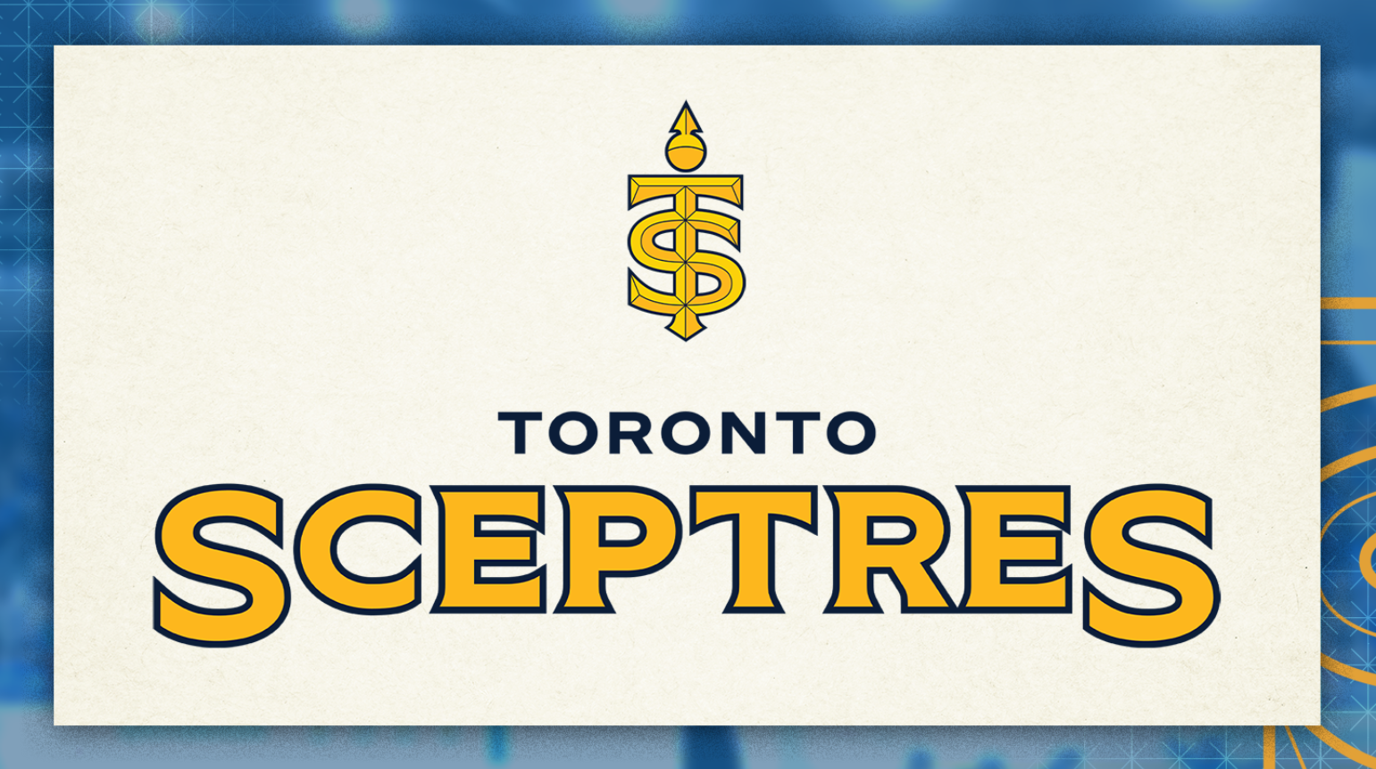
SG: The name "Sceptres" is very cool, very regal. It will take me a while to remember how to spell it, but I assume that wasn’t the criteria they used in their vetting sessions. The blue Toronto used in their first season is gorgeous, and blue and gold are naturally complementary. Royal themes are always fun, plus hockey players do wield sceptres of sorts, so the parallels are abundant. The logo is a bit complicated for me, though, and also flat upon first glance. The animation of it, with the slicing sound of metal from their hype video really brings it to life.
LK: On the one hand, the logo looks like the Taylor Swift cheerleader logo from the “Shake It Off” video, which is rad. On the other, the logo looks like the Taylor Swift cheerleader logo from the “Shake It Off” video, which is kind of a bummer. It doesn’t feel very unique! It’s beautiful, and it fits the name (which I LOVE), but I think I’d like it more as an alternate logo than as the main.
Our unanimous winner of the branding and name reveals?